GLOBAL MEAN TEMPERATURES - How BS is passed along to us
i have retired from all my executive and do-gooder activities. now i am really retired at age 80. i now have time to work on my family genealogy, and my favorite subjects: climate change; futures and inequality. i am in the process of updating my blog which contains more than 20,000 articles on global warming; all of which i have read. DO NOT BE IMPRESSED. Most of the 20,000 articles are pure bullshit, no science involved; many are media hype with no sources or real substance; and there are no peer reviewed articles proving or supporting the claims of anthropogenic, man made, global warming.
i have attached an old article: the Surface Record: produced for the Greening Earth Society. if you read the report carefully, you will be shocked at how bad our weather gathering procedures are; and how inaccurate the data that was collected. therefore the GMT conclusions are MOSTLY BULLSHIT.
Note that the Greening Earth Society, a PR firm, is now defunct. But the findings of the Surface Record have never been challenged substantively.
one would think that an orgaization like NASA would be more careful or more scientific rather than political. NASA chief, JAMES HANSON, a shill for Global Warming bigots) has been criticized for distorting information reported in the NYTimes about Global Mean Temperatures (GMT). [of course, NASA would always correct their reports in errata on page 99.] You would think a bunch of rocket scientists would know that the orbits of weather satellites decay, which distorts the weather temperatures, because the distances to earth have decreased BY DECAY, causing higher temperature readings.
{The “Surface Record” - SEE NEXT PAGE BELOW - a report on measuring global mean temperatures, given to the Greening Earth Society, described the disastrous results in NASA GMT Reporting because small errors in temperature measurements disproportionately vitiated the measurements.}
The `Surface Record'
Report to the Greening Earth Society
on `Global Mean Temperature'
and how it is determined at surface level
John L. Daly
![]()
Measuring Surface Temperature
The `surface record' comprises the combined average of thousands of thermometers world-wide in every country, recording temperatures in standard white louvred boxes called Stevenson Screens, usually mounted one metre above the ground. The boxes are mostly placed where there are suitable people to read and maintain them, such as at post offices in town/city centres, airports, pilot stations, lighthouses, radio/tv stations, farms, and cattle stations. By far the majority are located in towns and cities.
Marine temperatures are determined from ship data, usually measuring the temperature of the marine atmosphere from stevenson screens mounted near a ship's bridge, and sea surface temperature from intake pipes in the ship's hulls.
The resulting data is statistically collated by two leading institutions, the NASA Goddard Institute for Space Studies (GISS) in the U.S. and the Climatic Research Unit (CRU) at the University of East Anglia in Britain [11]. The process they follow is -
1) Select the stations to be used in the global database
2) Apply corrections for urbanisation to data originating from urban areas.
3) Divide the globe into 5°x5° latitude/longitude boxes
4) Determine the temperature `anomalies' for each box based on available data.
5) Combine the trends from all the boxes to arrive at an overall `global mean temperature'.
(boxes which have no data are left blank. They are not estimated from neighbouring boxes).
The final two steps are achieved by calculating a weighted average of the monthly mean temperatures of the chosen stations within the grid-box [11]. This average is then compared against a 1961-1990 reference period, the final figure obtained being the temperature anomaly for that grid-box for any particular month. The weighted hemispheric and global annual average anomaly is then determined from that monthly data.
So far so good. On the face of it, this should result in a reasonably accurate measure of global temperature trends. The final global result from GISS is shown below:
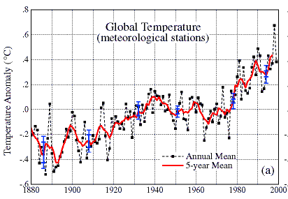 As we can see, this GISS graph shows a sustained warming of about +0.6°C from 1890 to 1940. Then there was a cooling of about -0.2°C from 1940 to 1975, followed by a second phase of warming of about +0.5°C from 1975 to the present. Of particular interest with this second warming phase is the +0.4°C warming from 1979 to the present.
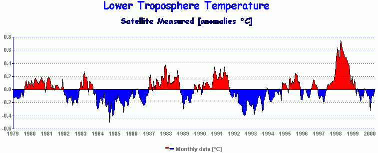
This is because from January 1979, NOAA satellites were measuring the temperature of the lower troposphere (1,000 metres altitude to 8,000 metres) [24], using `Microwave Sounding Units' (MSU) mounted on the satellites and monitoring microwave emissions from oxygen molecules in the atmosphere. The wavelength of these emissions are directly related to the temperature. According to the Marshall Space Flight Center which control these units, the temperature so measured is accurate to within 0.01°C.
It is a basic tenet of climatology and meteorology that the troposphere (the whole atmosphere between the earth's surface and the tropopause 15 kilometres above) is a `well-mixed layer', due to all the atmospheric turbulence which we know as `weather'. Due to this mixing, any tendency toward warming or cooling at the surface will also manifest itself at every level right up to the tropopause. Indeed, the General Circulation Models (GCMs), the source of the `global warming' predictions from rising CO2, also show this tendency to convective mixing [18], and the whole theory of greenhouse warming is itself founded on this understanding that the troposphere is `well-mixed'.
And it is here that the plot thickens.
![]()
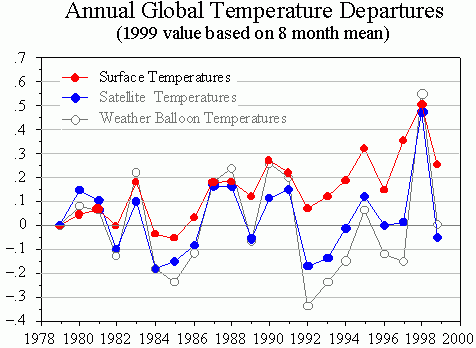
The Satellite Record
While the surface record was registering a global warming of +0.4°C between 1979 and the present, the satellite MSU record was showing a quite different trend. It was also showing a warming, but less than +0.1°C, not the +0.4°C claimed for the surface. Even this small trend was not evenly spread across the full 21 years, nor was it truly global. Instead it resulted from the warmth of 1998 caused by the big El Niño of 1997-98. Up to that time, the satellites were actually registering a slight global cooling. After the effect of 1998 is included, the Southern Hemisphere still shows a slight cooling, only the Northern Hemisphere showing a small warming for the full 21 years.
While `global warming' skeptics had been expressing public disquiet about this discrepancy between MSU and surface for many years, the gap between them had simply become too large to be ignored any longer, not even by those institutions who had been predicting global warming due to human activity and greenhouse gases [12].
Even more puzzling was that the MSU record was not diverging from the surface record everywhere. Instead, the two records were in close agreement over North America, Western Europe and Australia, the very regions where the station records were properly collected and maintained. Elsewhere, the surface and satellites diverged, the surface record showing a significant warming, while the MSU was showing an almost neutral trend.
The biggest differences between the two records [12] occur in -
1) A broad band over the Indian Ocean and Southeast Asia
2) West Africa
3) Central Brazil
4) Polynesia
5) Pacific Ocean east of Mexico
6) Northeastern Siberia
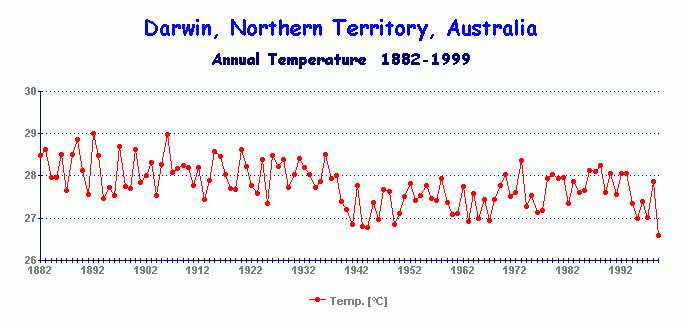
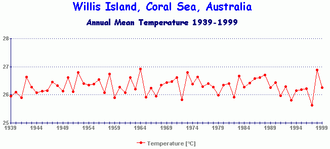
Clearly, these are not the regions where we have reliable, consistent, and well maintained surface records, and it is hardly credible to associate the divergence between the satellite and surface records to natural causes, when the `natural causes' are so selective as to avoid the well-monitored populated areas in OECD countries. Southeast Asia has been so racked by war and political upheaval in the 20th century that its records lack continuity and consistency. Tropical stations in Malaysia and Indonesia show warming, while Darwin and Willis Island in Australia, both tropical stations in the same region, do not.
![]()
The Great Puzzle
When we think about the problem logically, there would appear to be three possible explanations for the divergence between the two data sets -
1) The surface record could be showing a false trend.
2) The satellite (MSU) record could be showing a false trend.
3) Both are showing correct trends, the divergence caused by unknown atmospheric processes.
Enter the `radio sondes'. These are thermometers carried aloft in helium balloons to measure temperature in the lower troposphere and sending real-time temperature data back to the ground using on-board radio. The radio sondes measure temperature in exactly the same part of the atmosphere that is monitored by the satellites, and do so using entirely different methods [2].
The sonde record closley matches the MSU record as shown in this `World Climate Report' graph.
 The combined research institutions which promote `climate change' (a euphemism for human-induced global warming), when faced with the three choices above, initally chose to go for no.2 - `the satellites must be wrong', even though the sonde evidence indicated otherwise.
The satellite MSU record was subjected to several searching, and basically hostile, reviews by scientists outside the MSU programme [28]. After some persistent analysis, an orbital drift error was found which caused the satellites to understate the temperature - by seven hundredths of a degree [28]. Another slight error was found of the reverse sign which resulted in a downward revision. The net effect was that the satellite record was corrected upwards by a few hundredths of a degree, but still leaving the basic problem of the trend divergence unresolved. Even so, the miniscule corrections led some scientists to proclaim that the satellites were now `more consistent with the surface'.
This was rather like saying that driving home from work in New York brings you closer to California, technically true, but also ridiculous.
Option 2 (faulty satellites) had failed, the growing divergence between the two records remaining as stark as ever. This finally induced the National Research Council to convene a panel of experts to examine the problem, their report published in January 2000 [18]. Instead of canvassing the obvious - that the surface record might be wrong and should be reviewed just as thoroughly as the satellites had been, the NRC instead chose option 3, claiming, incredibly, that both records were right and that the problem must therefore lay with some hitherto unknown process within the atmosphere, a process even the models could not detect, an atmospheric process which somehow avoided those very regions where surface monitoring was effective.
The NRC endorsed, without sound evidence, the idea that there were differential trends at work, thus preserving the surface record as the basic yardstick for climate change. It was also clear from the wording of the NRC Report that the panel were deeply divided over the issue, and that the final endorsement of both data sets was more a compromise solution. These compromise findings lacked any real conviction. The latest draft `Third Assessment Report' of the IPCC [9] took the NRC lead and now presents the surface record as an indisputable assumption underpinning all their other predictions. The MSU record is relegated by the IPCC as supplementary evidence only.
![]()
`Option 1' - Is the Surface Record Wrong?
Since Option 2 (satellites wrong) had been ruled out, while Option 3 (both records good) is merely a compromise to appease conflicted interests, we are left with Option 1 - the surface record must be wrong. In posing this solution, we must first be clear about where errors could creep into the surface record.
There are five potential areas of error.
1) Errors caused by environmental change in the general location of the measuring instrument.
2) Errors arising at the point of measurement, such as equipment or procedural faults.
3) Errors arising from statistical processing by GISS and CRU, such as poor station information
4) Errors arising from station closures altering the homogeneity and balance of the network
5) Errors caused by uneven geographical spread
1) Environmental errors
The Urban Heat Island Effect [13] is the first major source of error, caused by the tendency of concrete, roads, and buildings to heat up to high temperatures in the daytime and slowly release that heat during the night, resulting in a higher daytime and even higher nightime temperature than would exist in a nearby rural area. The effect increases with the size of the urban area, so that as towns and cities undergo their natural growth over time, so too does the measured temperature increase in step with that urban growth. This gives a false impression of long-term warming. The same effect is also evident at major airports due to the sheer extent of concrete runways, taxiways, revving aircraft engines and terminal buildings.
The existence of this phenomenon is well documented and beyond dispute [4] [20] [1]. Indeed, Karl et al [13] found a significant urban warming effect of about 0.1°C from 1901 to 1984 for US stations with populations as low as 10,000.
To be completely free of the urbanisation problem, a site needs to be strictly `greenfields’, where there is no urbanisation whatsoever. Such sites are few and far between, but they do exist, and most of them do not show warming or show weaker trends than is claimed for the globe as a whole, as shown in the station records in the Appendix.
In addition to heat islands, we also have environmental errors created by the micro-environment in the immediate vicinity of the box itself. Where there are boxes, even `greenfields’ ones, we also have people. People typically change the micro-environment to suit their own preferences, such as growing bushes, trees, erecting sheds and fences, or turning a bare piece of ground into a garden. Most such changes occur over time, such as tree or bush growth, and have two effects. One of them is to reduce the visible skyline of the box (a problem highlighted by radiation expert Dr Doug Hoyt), which reduces the ability of the box to radiate its heat to space, but instead is subject to increased infra-red radiation from the growing obstructions. The shrinking skyline effect as he calls it, is a warming creep error in the measured temperatures.
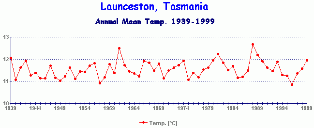
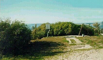 The other effect of the shrinking skyline is that the obstructions themselves can act as a wind break. This was most evident at Low Head Lighthouse in Tasmania (BoM photo) where a box mounted on a headland in a perfect spot, exposed to the prevailing north-westerly wind, ended up in a mini sun trap caused by nearby bushes growing high enough over a period of many years to screen off the prevailing wind. Photographs from the 1940s show no bushes and a more exposed aspect than exists there today. The result has been a sharp rise in daytime temperature, a warming not reflected in neighbouring sites such as Launceston Airport 40 miles inland (graph).
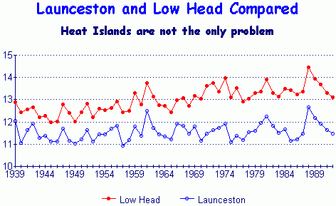 Notice how Low Head clearly warms by +0.5°C from 1939 to 1992 compared with Launceston. This warming is achieved entirely during the daytime, due to the effect of the bushes on the left of the photo. Since Low Head is a `rural' station, being located on the grounds of a coastal lighthouse, its warming trend was irresistible to some researchers to use it as a climatic reference [3].
In Australia, the National Climate Centre (NCC) has singled out 100 stations across Australia as `climate reference stations'. Here is their stated definition of a `climate reference station' -
"A climatological station, the data of which are intended for the purpose of determining climatic trends. This requires long periods (not less than thirty years) of homogeneous records, where human-influenced environmental changes have been and/or are expected to remain at a minimum. Ideally the records should be of sufficient length to enable the identification of secular [over time] changes of climate."
 Low Head Lighthouse is one of those designated stations, even though the NCC are aware of the daytime anomaly there. Here is another of their `climate reference stations' (BoM photo left), Tewantin in Queensland, located in a car park under a sub-tropical sun! Data collected from such stations are the raw material for the GISS and CRU statistical proccessing to arrive at `global mean temperature'. No other self-respecting science would accept data collected in such an error-prone environment.
2) Point of measurement errors
Good site maintenance is essential if the instruments are to give a continuously accurate record. This means keeping the box clean and white, keeping the louvres clear, keeping the instruments clean, and where the sea is nearby, to keep them free of salt deposits (which attract moisture), and avoiding changes to the local micro-environment in the immediate vicinity of the box itself. It is also necessary for regular calibration of the instruments themselves as thermometers tend to deform over time, [30] leading to a warm creep error.
Consider cleanliness as an example. The boxes are painted white for a good reason, which is to reflect sunlight so that the box itself does not heat up and give false readings. This means that the box needs an occasional paint job and to be regularly cleaned to maintain the proper degree of whiteness. If this is not done, the box gets progressively dirtier over time. A dirtier box is a warmer box. Lack of simple cleaning and painting will cause the measured temperatures to show a warming creep over time, a creep which might confuse researchers thousands of miles away. They see only the numbers recorded from the box, leading them to incorrectly assume that a climatic warming was underway at the site.
Then there’s the louvres. These allow the instruments inside the box to be properly ventilated while being shielded from direct solar and infra-red radiation from outside. Such louvres are traps for blown dust and dirt, while spiders find them ideal for cobwebs. The louvres should be cleared regularly to maintain proper air flow to the instruments inside. If this is not done, the box will lose ventilation efficiency and the interior will get warmer over time. Again we have a box-induced warming creep, giving a distant researcher the impression of climatic warming. (See ref.[15] for an excellent discourse on the problems of historical temperature measurements)
Having said all that, how well do poorer countries maintain their stations? Can they afford the maintenance? Is such maintenance even a priority for them? USA stations are properly maintained as are the stations in Europe and Australia, but that’s barely 6% of the planet. For example, a country like Russia which hardly ever pays its officials these days and cannot afford to even render their obsolete nuclear submarines safe, would hardly put a priority on maintenance of weather boxes. The ragged state of many records from non-OECD countries suggest not only bad maintenance, but also poor management, and a generally low priority on data collection. No amount of elaborate computing and statistical processing at CRU or GISS can turn bad data into good. If the starting data is bad, all subsequent analyses will inherit those faults.
Whether urban or rural, the current standard measurement practice is to record the daily maximum and minimum temperatures [11] at each site and to average these out over a month and a year to give a mean temperature. The mean temperature for each grid-box is then obtained by integrating the data from the individual sites within the grid-box (if there are any).
But it was not always so. Prior to adoption of these standards, it was common for data to be collected in a variety of ways, such as measuring the temperature every 6 hours, or twice a day at fixed times, or at other times convenient to the people collecting the data who often had other things to do [7].
In many instances, particularly at isolated sites, there have been anecdotal reports of people at the site neglecting to record the temperature on some occasions but later filling in data in their log books in order not to lose the small stipend they receive for such work. There have been reports of seaside tourist resort operators (who may also happen to be the town weather recorder), increasing the temperature a few degrees in the hope of attracting more visitors.
In the old Soviet Union (one sixth of the land surface of the planet), falsification of data of all kinds was a way of life (especially during the Stalin, Khrushchev and Brezhnev eras, when statistics were routinely altered to avoid problems with the planning bureaucracy). Thus the accuracy of Soviet historical data is dependent on whether local officials found it necessary, for economic reasons, to overstate or understate their recorded temperatures. Anomalies in fuel allocations for transport, industry and heating under the rigid communist 5-year plans, amounts to a powerful motive for falsifying temperature data in some Soviet communities.
A further procedural error has been the conversion in recent years from manual reading to remote automatic reading of the temperatures in the boxes. During the manual days, opening the door of the box increased ventilation, thus cooling the instruments just prior to being actually read. Today, with automatic monitoring, the box door is hardly ever opened and so the temperature recorded will be slightly higher, thus giving an impression of warming of perhaps one or two tenths of a degree.
The warming of the 1920s may have been partly influenced by changes in the measurement procedures from that of mainly `fixed times' to one of maximums and minimums only [7]. If thousands of sites world-wide all change their procedures over a period of a decade or so, a distinct climate change will show up in the long-term aggregate data. While there is no dispute that a 1920s warming did happen (a warming now conceded by the IPCC to have been caused by increased solar radiation) [9], the change in measurement procedures may have exaggerated the size of that warming.
The rise in solar activity at the early part of the 20th century would be certain to raise global temperature by +0.15°C without any feedback effects. However, the surface record indicates a warming four times greater than that, giving rise to the possibility that the additional `warming' in the surface record resulted either from the procedural changes phased in during the inter-war period, or from positive feedback effects from the solar warming [29] [8] [25] [14].
3) Statistical processing errors by GISS and CRU
Since the vast majority of land-based readings are taken in growing towns and cities, we inevitably end up with a long-term warming creep in the averaged data, a creep which both GISS and CRU attempt to correct.
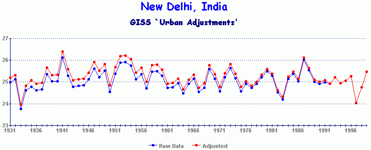
Here is one example of their urban adjustment, that of New Delhi, India, a sprawling and growing city of 8 million people. The adjustment amounts to a miserly 0.2°C over 68 years, a patently inadequate correction for such a large urban sprawl. Ironically, New Delhi shows a cooling up to 1999 no matter which version of the record one chooses to accept.
This is not an isolated example. Here is how GISS treats Ankara, the capital city of Turkey.
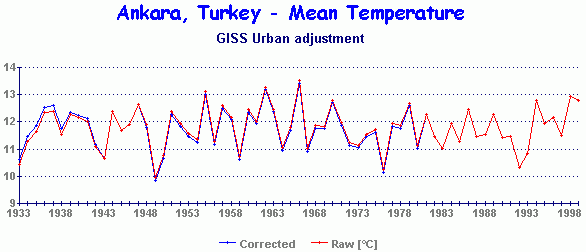
Again, the correction used is only 0.2°C over 66 years. These adjustments are manifestly inadequate and based on applying procedures which may be valid in the high-quality US station network, but which create these anomalous outcomes when the same criteria are applied to non-OECD records.
Some research groups have attempted to cross-check the general surface network by comparing it with selected `rural’ stations to determine the size of the heat island error, if any [1] [10] [13]. However, the definition of the term `rural’ then becomes critical, as such groups typically regard towns of several thousand people as `rural’. One group even defined `rural’ to mean towns of up to 50,000 people ! [6]. GISS defines `rural' as meaning towns with 10,000 people or less. Unfortunately, GISS has been found to be using outdated population estimates for many of their stations, resulting in possible processing errors when urban adjustments have to be made. For example, GISS lists Alice Springs in central Australia (a climatically strategic station) as having 18,000 people. However, the 1991 census shows it to have 25,585 people, and it has continued growing in the 1990s. This is more serious than it looks because Alice Springs is the only well-maintained site to cover a vast area of central Australia. To use an outdated population figure can result in making inadequate urban adjustments affecting the perceived climate over the entire 5x5 grid-box in which `the Alice' sits.
The poor state of maintenance in some rural sites creates a special problem when GISS and CRU attempt to make urbanisation adjustments of city data in non-OECD countries. One way to achieve an adjustment is to compare the city temperature record against a similar record from a nearby rural station and correct the city record accordingly. This is what happens in the USA and explains why some city stations like Sacramento have a quite large urban adjustment (1.5°C), but an even larger city like Atlanta has a smaller adjustment (1°C). In Atlanta's case, comparison with the nearby rural station of Newnan, establishes that the Atlanta adjustment is a reasonable one in spite of the huge growth of the city. Dallas has a very small adjustment (a mere 0.2°C), but again it is being compared with well-maintained rural stations close by. Denver is smaller still with an adjustment of only 0.1°C.
But what if the reference rural station is faulty? It's record could be subject to warming creep simply through bad maintenance and site management. If the city trend is then adjusted to match the trend at that rural site, we have the paradox of a city record well maintained and managed, but victim of the urban heat island, being then adjusted to match the trend of a nearby rural station which, while free of the urban effect, suffers its own warming creep from simple bad maintenance and other site-specific effects . Either way, we lose. For non-OECD countries, the procedure of adjusting big cities against poorly maintained rural stations can only result in false trends.
Another way to apply urban adjustments to data is to apply a simple formula based on the latest population census data and adjust the city record accordingly [13].
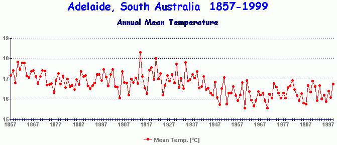
While this may seem superficially sound, this approach would ignore the vast differences between cities. US and Australian cities have large suburban sprawls with extensive vegetation. European cities tend to be densely populated with much less vegetation. In non-OECD countries, the urban sprawls are often unplanned, devoid of vegetation cover, seething with traffic and people, and highly polluted. A `population formula' could only work if the formula itself was specific for each urban area, an impossible task. While we commonly assume that all cities will have local warming to a greater or lesser degree, some urban areas can actually cool due to the way they are laid out or managed. For example, Adelaide in South Australia has cooled 1°C since the war due to it's being spacious, well vegetated and watered in an otherwise desertified environment. Clearly, no one magic formula can work.
A further problem with the statistical processing is that neither GISS nor CRU can inspect the siting or maintenance of the thousands of stations they include in their data set. Thus even stations which might reasonably be assumed to be `clean' like Low Head Lighthouse, may actually conceal site-specific errors which are known only to people who are local to the station.
As to station selection, not all stations in the world are included in the global data sets. This raises the question as to what criteria are used when selecting stations when the researchers at GISS and CRU have little local knowledge about the stations themselves. Indeed, they have shown no hesitation in accepting big-city stations into their data sets, knowing full well that urbanisation will be a wild card in the data.
The Australian Bureau of Meteorololgy (BoM) did attempt a station-by-station analysis of error-producing factors for Australian stations, including urbanisation, and offered an adjusted dataset of all Australian stations [26]. The corrections included Low Head Lighthouse whose record was `cooled' and brought more into line with nearby Launceston Airport. However, GISS and CRU are still using the original dataset, not the modified one offered by the BoM.
4) Station degradation and closures
Since about 1980, there have been numerous closures of stations across the world as governments have sought to cut expenditure in public services [11]. The loss of stations has been particularly significant in the southern hemisphere where the station density was already thin to begin with. The adoption of the 100-station `climate reference network' to cover the vast Australian continent suggests a further downgrading of stations not included in that hundred.
This has an unintended consequence for the statistical calculation of `global mean temperature'. In each 5°x5° grid-box any thinning out of the number of stations over time will result in a smaller mix of stations in the 1980s-1990s than was the case in previous decades, with a consequent shift in the mean temperature for each grid-box. This shift could theoretically result in a warming creep in some sectors and a cooling creep in others, not caused by climate, but caused by a shrinking station integration base. Another response to these closures is to accept stations into the database which had previously been excluded [11]. This could result in sub-standard stations contaminating the agreggate record even further.
The end result cannot be statistically neutral because the majority of the stations being closed are precisely those stations which GISS and CRU designate as `rural'. These are the very stations which have the least warming, or no warming at all, and their closure during recent decades leaves that entire period to the tender mercies of the urban stations - i.e. accelerated warming from urbanisation. It is little wonder that the 1980s and 1990s are perceived to be warmer than previous decades - the collected data is warmer. But was the climate itself warmer? The surviving rural stations would suggest not.
|
Station closure is not the only problem. Many stations in the 1990s exhibit degraded data. This is particularly evident in the countries of the old Soviet Union, representing one sixth of the land area of the earth. This table is the temperature record of `Mys Smidta' a station on the east Arctic coast of Russia, a strategic location for monitoring Arctic climate. But look at its state of degradation since 1991 when communism fell in Russia.
Whole months (shown by `ND') are missing, rendering the station record next to worthless. With such neglect, even those months which are logged must be treated with suspicion. Yet GISS still processes stations like this from Russia and the old Soviet Union, using data which would be summarily rejected by any other science. |
5) Uneven geographical Spread
This poses a problem since land only occupies 29% of the earth’s surface. The network of white boxes can only measure temperature on land, not the 71% of the planet represented by the oceans. Islands can give some indication of marine temperature, but in many cases these are widely scattered and usually located in the largest town on such islands.
Even within the land areas, vast areas of desert, tundra and mountains have also not been monitored. Thus, one region, such as central England, may have scores of boxes, whereas vast continental areas like central Australia would be lucky to have just one.
Where a 5°x5° grid-box only has one site, that site’s temperature must then become the temperature applicable for that entire sector. For example, a large part of central Australia, is represented by the instrumental record at Alice Springs, an urban site [26], (or is it rural? - It has 25,585 people which puts it squarely within some definitions of `rural’).
In some cases, there are no sites within a grid-box (e.g. vast areas of ocean, large deserts etc.), in which case the temperature for such a square is left blank, `global mean temperature' effectively meaning the mean temperature of only those grid squares containing data, not the whole globe. By contrast, the satellite record covers nearly the whole globe with even geographical spread.
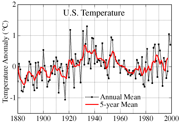
The temperature history of the continental USA from GISS (shown above), using hundreds of quality sites, adjusted where necessary against urbanisation errors, shows a very different recent picture to that of the GISS-CRU global average. The pre-war warming is certainly there, well before greenhouse gases were significant, but the post-1975 warming is much weaker and does not exceed the peak warmth achieved in the early 1930s. It is now acknowledged by the IPCC [9] and most other climatologists that the pre-1940 warming was completely unrelated to greenhouse gases, that instead it was caused by rising solar activity, a high level of activity which has been sustained for the last 60 years.
Given the USA's size, position, and integrity of station data, it is tempting to conclude that the long-term trends we see for the USA can be assumed to be equally valid for the rest of the world. Records from individual rural sites all over the world certainly suggest this is so. (See stations list in the Appendix.)
While those grid-boxes with a large density of stations may provide a valid average, grid-boxes with only one or two stations are hostage to any isolated local errors. It is no accident that the scale of the recent global warming reported by GISS and CRU is produced primarily by data from outside North America and Western Europe.
South Africa is an interesting case [17] in that it has maintained a good station network on a continent lacking in consistent records. Balling & Hughes [1] found that about half of the warming reported by CRU during the early 20th century [10] was directly attributable to urbanisation. As for the later decades, Balling & Hughes found no significant warming at all at the rural stations, contradicting the CRU city-based record which did show warming.
We return to the central question. Is the surface record wrong in respect of both the amount of warming reported during the 1920s and in respect of the disputed warming trend it reports since 1979? In the latter case, the surface record is contradicted by both the satellite MSU record and the radio sonde record [2].
This is where individual station records can prove useful. Such records represent real temperatures recorded at real places one can find on a map [23]. As such they are not the product of esoteric statistical processing or computer manipulation, and each can be assessed individually.
Some critics will dismiss individual station records as merely `anomalous' (in which case most of the non-urban stations would have to be dismissed on those grounds), but when one station acquires an importance far beyond its own little record, no effort is spared to discredit it. This was the fate of Cloncurry, Queensland, Australia, which holds the honour of having recorded the hottest temperature ever measured in Australia, a continent known for its hot temperatures. The record was 53.1°C set, not in the `warm' 1990s, but in 1889. It was a clear target for revisionism, for how can a skeptical public be convinced of `global warming' when Cloncurry holds such a century-old record? The attack was made by Blair Trewin of the School or Earth Sciences at the University of Melbourne [27], with ample assistance from the whole meteorological establishment. And all this effort and expense was deployed to discredit one temperature reading on one hot day at one outback station 111 years ago. Stations do matter.
In the Appendix, there are numerous station records from all over the world, most of them from completely rural sites, some of them scientifically supervised. One telltale sign of any good record is when the data extends back many decades with no breaks. Where the record is unbroken, it indicates better than anything else that the people collecting the data take their task seriously, a good reason to also have confidence in their maintenance and adherence to proper procedures. Where the record is persistently broken, such as Mys Smidta and many other Russian and former Soviet stations, there is no reason to have any confidence in the fragmentary data they do return.
However, this is not the way GISS, CRU, or the IPCC view them. In spite of the station closures, and the fragmentation of so much Russian and former Soviet republic data, the surface record continues to be accepted uncritically in preference to the well validated satellite and sonde data. Indeed, in the latest drafts of the IPCC `Third Assessment Report' [9], the surface record is taken as a foundation assumption to underpin all the predictions about future climate change. To admit the surface record as being seriously flawed would unravel the integrity of the entire report, and indeed unravel the foundations of the `global warming' theory itself.
![]()
Marine Temperatures
Over 70% of the planet is represented by the oceans and the only indication of marine atmospheric temperature history comes from small islands, ships, and more recently ocean buoys. In some cases, the air temperature is measured in the usual way from a Stevenson Screen located on an island or a ship, while in others the sea surface temperature (SST) is used as an indicator of climate change, if any.
This suffers even more from geographical spread problems than the land temperatures. The temperature recorded on an island is often from the only town on that island and thus affected by its own urban heat island and other warming creep errors already mentioned.
In the case of ships, the instruments are generally maintained properly and the micro-environment is not subject to much change [21]. However, ships are constantly travelling so that successive temperature readings would be taken up to 100 miles apart. In addition, the recorded temperature is profoundly affected by the relative slipstream over the ship. During a head wind, the slipstream sweeps away any local heat from the ship's steel structure (particularly from the funnel area), but during a following wind, the ship carries its own `heat island' along with it. This can result in differences in recorded temperature of up to 10°C between two ships sailing in the same area.
(I particularly recall an occasion during the 1960s when I was aboard a ship without air conditioning sailing down the Red Sea, travelling at 15 knots with a 15-knot following wind. Thus there was no slipstream over the ship since we were travelling at the same speed and direction as the wind. The funnel exhaust was vertical. Under those conditions, we were being crucified at temperatures around 40°C, while a passing ship, travelling in the opposite direction, enjoyed a 30-knot slipstream over their decks, which they reported over the radio as giving them a temperature of 30°C, hot but bearable) [21].
Ship instruments also suffer constantly from salt deposits brought in from spray, and these deposits can also distort the reading accuracy.
Ships travel on well-established routes so that vast areas of ocean, are simply not traversed by ships at all, and even those that do, may not return weather data on route. Attempting to compile a `global mean temperature’ for 70% of the earth from such fragmentary, disorganised, error-ridden and geographically unbalanced data is more guesswork than science.
As to sea surface temperatures (SST), this data is even more fragmentary than the air temperature readings. Prior to around 1940, SST was collected by throwing buckets over the side of a ship, hoisting it on deck and dipping a thermometer in it. Bucket data is only useful for immediate weather prediction purposes, not for long-term statistical climatic analysis. Any other data collected in such bizarre ways would be laughed out of any other scientific forum.
In 1989, MIT did an analysis of SST bucket data, but could only find a +0.2 deg.C warming between 1860 and 1940, hardly the stuff of catastrophes [19]. But post-1940, things seemed to improve as SST was now measured directly from water intakes beneath the hulls of ships. Of course, the depth of this intake varies with the state of loading and the size of the ship - which can affect the recorded temperature. The ships still travel their established routes well away from regions of the ocean which still lack any data at all, and there are no scientific checks on the accuracy, calibration, or drift of most of the instruments used. So we are a bit better off than with the buckets, but not much.
The 1989 MIT study also analysed the post-1940s data but could find no warming at all.
Since the 1980s and 1990s we have satellites to measure SST [22] using infra-red sensors (not to be confused with the MSU instruments which measure the atmosphere). Unfortunately, satellites sensing SSTs in the infra-red can only see the immediate water surface, not the water even a few centimetres deeper. This is because infra-red radiation at these wavebands (around 10 microns) cannot penetrate water at all, and so the satellite can only `see’ that top millimetre. This can result in both warm and cool errors. On hot still days, the top centimetre of the ocean surface can be much warmer than waters a few centimetres deeper, similar to the same phenomenon which can be observed in any undisturbed outdoor swimming pool. On windy days, there is no such difference due to wave mixing. There is also an intermittent `thermal skin effect' [5] where the top millimetre of water on calm seas can be up to -0.3°C cooler than the water just beneath the `skin' due to evaporation taking place on the surface.
For these reasons, SSTs taken from satellites are only accurate to within a few tenths of a degree, adequate for immediate meteorological purposes or detecting an El Nino, but not suited to measuring subtle global climatic changes of a few tenths of a degree.
![]()
Rehabilitating the Surface Record
The only way surface data can be used with any confidence is to exclude all town/city and airport data - no exceptions. Only rural sites should be used, and by `rural’ is meant strictly `greenfields’ sites where there is no urbanisation of any kind near the instrument. Even when greenfields stations are used, those which are technically supervised (eg. managed by scientists, marine authorities, the military etc.) should be treated with greater credibility than those from sheep stations, post offices and remote motels.
This would reduce the available stations to only a small fraction of those presently used, but they would certainly provide a more accurate picture than the present plethora of stations, both good and bad, presently used by GISS and CRU.
Once suitable `greenfields’ sites have been identified, the station history of each site needs to be examined thoroughly, including old photographs, details of site moves, records of maintenance, procedural changes and a thorough on-site inspection of the micro-environment. Only then can meaningful corrections to data be contemplated. Any such corrections should be independently reviewed. In-house review by fellow `peers' is hardly likely to convince a skeptical public.
A good example of this attention to station detail can be found with the Alaska Climate Research Center. Their website provides just this depth of historical and local geographical detail about their station network. It is interesting that this attention to such detail has resulted in Alaska returning an overall neutral temperature trend. Some parts show a warming, some a cooling, but nothing to suggest the kind of blanket accelerated warming claimed by GISS and CRU.
The first step in the rehabilitation of the GISS-CRU surface record, to allow some public confidence to be placed in it, is for it to be rigorously and independently reviewed in much the same way the satellite record was reviewed. Until that happens, any claims regarding recent warming must be treated with great skepticism. Furthermore any predictions about `climate change', such as those of the IPCC, which are underpinned by the surface record should also be disregarded until that essential review takes place.
![]()
Station Records and Climate Models
Pending an independent review of the GISS-CRU surface record (essential given the policy implications), it is valuable nevertheless to look at individual station records, particularly those which are known to be rural, have continuous and consistent data, and are known to be properly supervised. The `ideal' stations are those which have everything - a long-term record, no breaks, scientifically supervised, completely rural (ie. `greenfields'), and set in a climatically strategic location.
An example is Valentia in Ireland.
Valentia is located on an island in the extreme southwest of Ireland, right on the coast of County Kerry facing the North Atlantic. It is the first point of interception for the Gulf Stream entering northern Europe, and is directly exposed to the prevailing south-westerly winds which blow in from the ocean. It is the perfect location to monitor climate change.
As we can readily see, there has'nt been any.
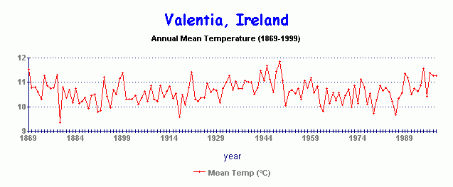
There has been variation year-to-year over a 2 degree range, but no overall trend since 1869 (a year which was itself warmer than 1999). The pre-war warming is present - just, but quickly followed by a similar cooling.
Once such stations are identified, it is useful to compare them with the predictions of climate models, given that CO2 has already been enhanced in the atmosphere. According to those models, the stations should be showing greenhouse signature effects by now, particularly warming at or near the polar regions.
 The climate models are very different from each other, both in the magnitude of their warming predictions and in how the warming is distributed regionally. It is common for the various models to profoundly differ as to which regions of the earth will warm (or even cool in some cases) or which regions will have significant changes in rainfall.
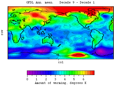
But they all agree on one thing - the warming will be concentrated heavily toward the high latitudes and the polar regions as shown by the GFDL model (top left) on a 100 year computer run from the present. It shows regional `hot spots' and `cool spots' but then so do all the other models - and all at different places. (The blue areas in the GFDL model do not indicate cooling, but merely smaller amounts of warming).
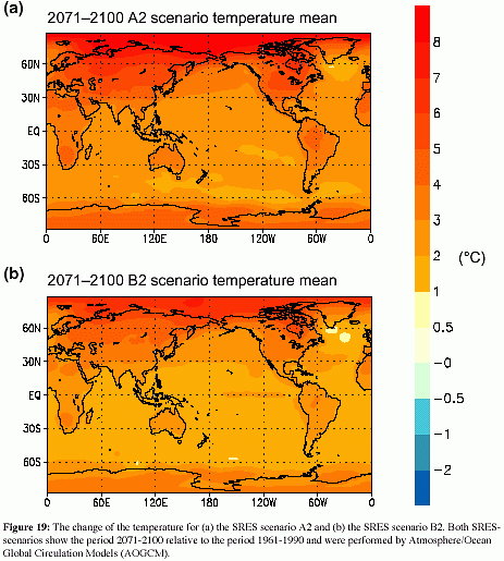 The lower model is published in the latest draft report of the IPCC [9], representing two alternative projections of global warming into the 21st century. Again, we see regional differences compared with the GFDL model, but the primary emphasis on polar warming is unmistakable.
There is a good reason for this unanimity about the warming of the polar regions. CO2 in the atmosphere absorbs and re-emits infra-red radiation in distinctive wavebands, particularly around 12 - 18 microns. Radiation at other wavelengths simply passes through the atmosphere without being intercepted by CO2.
The wavelength of infra-red radiation from the earth's surface depends on the temperature of the surface. All bodies emit infra-red over a wide band of wavelengths, but peak at a `dominant wavelength' determined by the temperature of the emitting surface. For example, an object with a temperature of 32°C will radiate most intensely at 9.5 microns. At 15°C (the mean surface temperature of the earth), the dominant wavelength will be 10 microns. At -25°C, it becomes 11.7 microns, and at -50°C becomes 13 microns.
Since CO2 gas absorbs and emits infra-red at wavelengths of 12 microns and above, this means it exerts its greatest leverage when the surface or atmospheric temperature is very cold, such as exists at the polar regions. This is why all the models predict the greatest warmings of all at the poles. A further reason for this polar warming bias in the models is that a small CO2 warming is predicted to increase relative humidity in the colder dry air, something it is less able to do in the more water-saturated tropics.
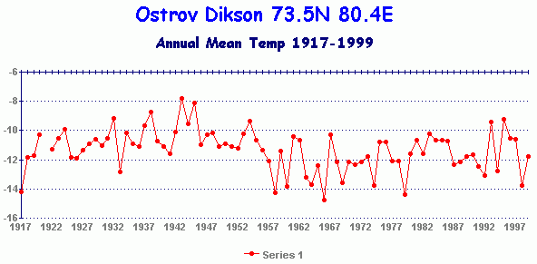
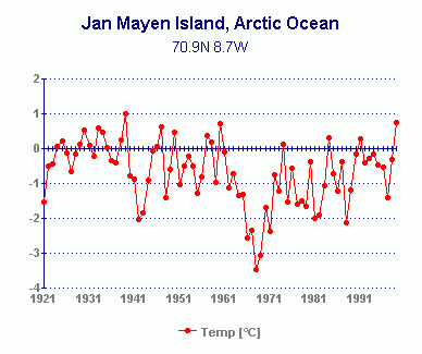
Herein lies the most significant `Achilles Heel' of the Greenhouse scenario. Since the models predict such large warmings at the poles, we need only examine the station records from those very regions to assess just how powerful - or weak - the CO2 greenhouse really is. Fortunately, we need not be overwhelmed by the thousands of stations, good and bad, which exist in populated regions, nor employ esoteric statistical processes. Stations in polar regions are fewer in number, but generally better maintained, scientifically supervised and free of urbanisation effects. There are no cities or car parks in the polar regions.
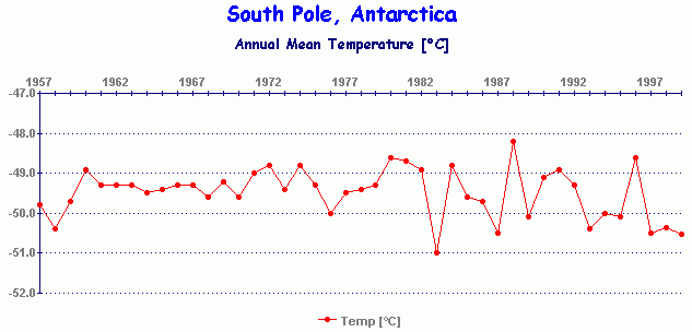
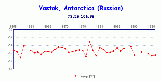
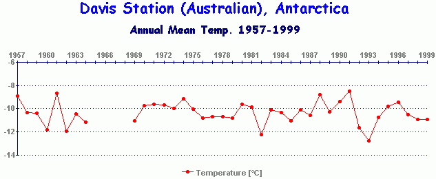
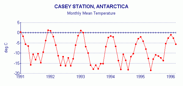
In the case of the Antarctic, the majority of stations show no warming, not even at the U.S. Amundsen-Scott Base at the South Pole, nor at the Russian Vostok Base high on the Antarctic ice plateau (which holds the all-time record for the coldest temperature ever recorded on the surface of the earth, -89.2°C in 1983). Some stations even report a cooling trend. This is significant because if CO2 cannot exert leverage in these, the coldest, dryest, places on the planet, it is unlikely it can have any significant effect anywhere else. These station records are included in the Appendix.
The only part of the Antarctic to have warmed in recent decades is the 2% of the Antarctic land mass represented by the Antarctic Peninsula, the only part of the land mass to partly lie outside the Antarctic Circle and thus be exposed to the temperate effects of the Southern Ocean. The remaining 98% of the continent has not been warming in spite of temperatures being cold enough to allow CO2 to exert a strong warming influence [9].
Faced with this lack of polar atmospheric warming, some scientists have speculated that the reason may lay with the energy of latent heat transfer. Whenever ice melts, a large amount of energy is used up to facilitate the melting process, leaving the temperature temporarily static at the freezing/melting point of water, i.e. 0°C (or -2°C in the case of sea water). Might this latent heat transfer be a genuine reason for lack of polar warming? Or is it merely a thin pretext to explain it away?
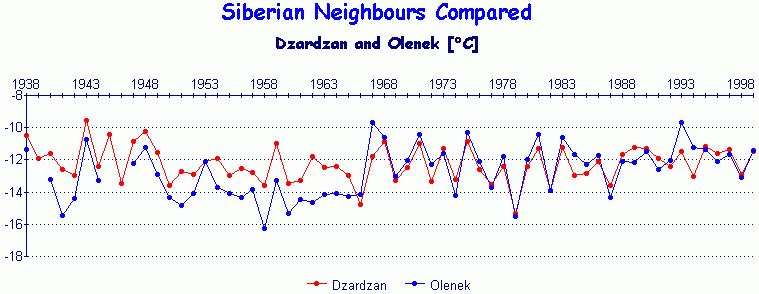
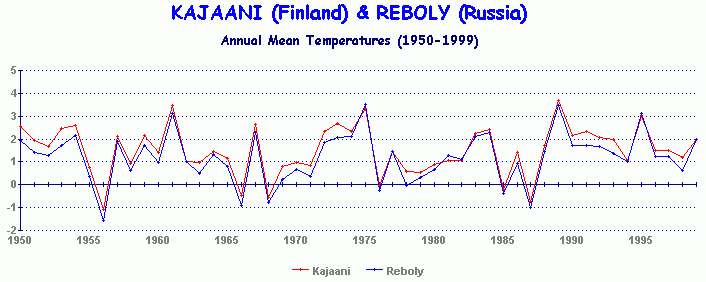
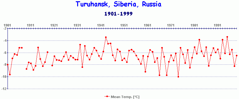
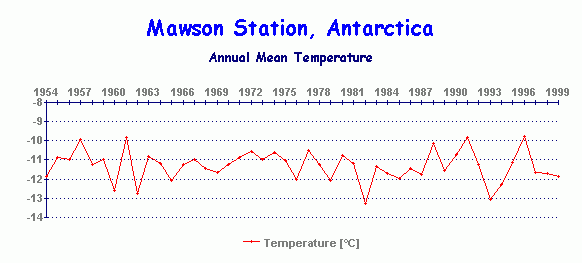
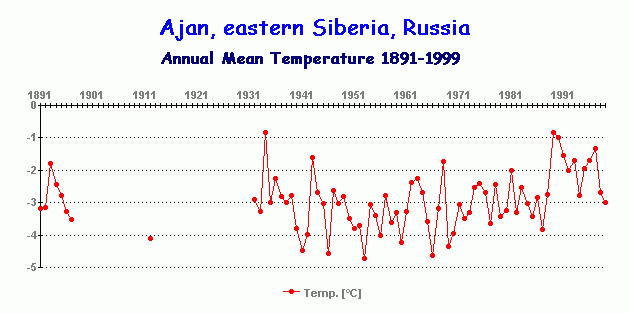
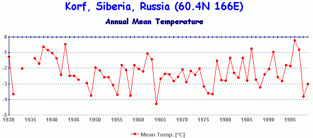
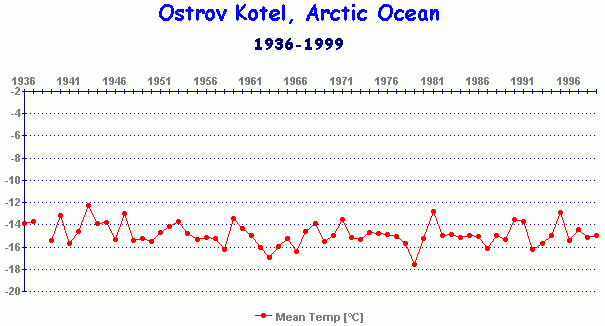
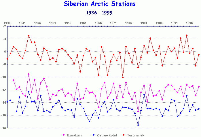
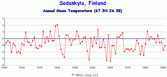
We need look no further than our stations for the answer. The latent heat argument might hold up in areas where the ice exposed to the atmosphere was already melting, such as at the sea-ice fringes where the pack ice meets open water. However, station records show this not to be the case. There is a lack of warming not only at the sea-ice fringes, but also well inland in Siberia (eg. Olenek, Dzardzan, Reboly, Turuhansk) and inland in Antarctica (South Pole and Vostok), well away from any possible latent heat transfer effects. Such effects cannot occur at sub-zero temperatures. Even the coastal stations in Antarctica such as Mawson Base show no warming, even though it is closer to the sea-ice fringe.
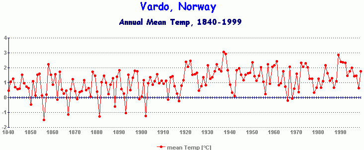
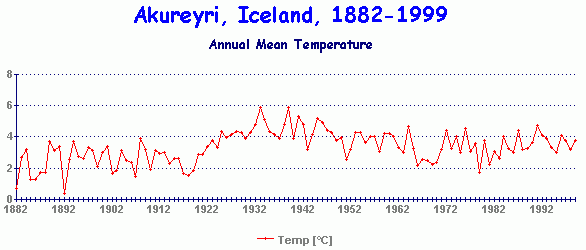
As for those stations in the Arctic which are ice-free, such as the coast of northern Norway, here again the latent heat argument would not apply since the open sea is already free to warm up without the delaying effects of latent heat extraction from ice melt (there being no ice to melt). Here we find the same lack of warming at stations like Vardo on the Arctic coast of Norway, and at Akureyri on the north coast of Iceland.
Michaels et al. [16] identified the lack of a greenhouse signature in the surface record in another quite novel way. It has long been claimed that the observed narrowing of the `diurnal range' in the surface record (i.e. the temperature gap between daytime maximum and night-time minimum), was a symptom of greenhouse warming. In fact, the greenhouse theory predicts this very outcome. They found the narrowing diurnal range only applied in latitudes between 55°N and 55°S, but not at the higher latitudes. This suggested that the lack of a narrowing diurnal range at sub-polar and polar latitudes, the very region where greenhouse warming was predicted to be at its greatest, indicated that the narrowing reported in lower latitudes was caused by a non-greenhouse process, such as increased cloudiness, or urbanisation (urban heat islands also narrow the diurnal range).
The conclusion to be drawn from station records at the polar regions, and the lack of a narrowing diurnal range, is clear. There is no warming either at the ice fringes, in the ice-free areas, inland, or in areas covered by sea ice. The same situation exists in the Antarctic where 98% of the continent is not warming at all. Yet these are the very regions which, according to the models, should already be showing a strong warming trend already.
If they cannot or will not warm, it will be a long wait before we would see warming anywhere else.
John L. Daly
10th May 2000
![]()
Appendix - Station Records with data to 1998 or 1999
Note particularly those stations in the Arctic and Antarctic regions. The greenhouse theory and the models both suggest that the greatest warmings of all will take place in the coldest of places on earth, for reasons connected with the absorption-emission wavelength characteristics of CO2.
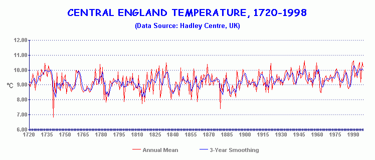
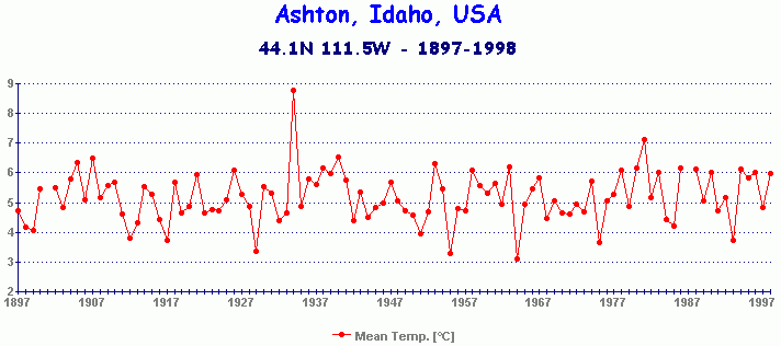
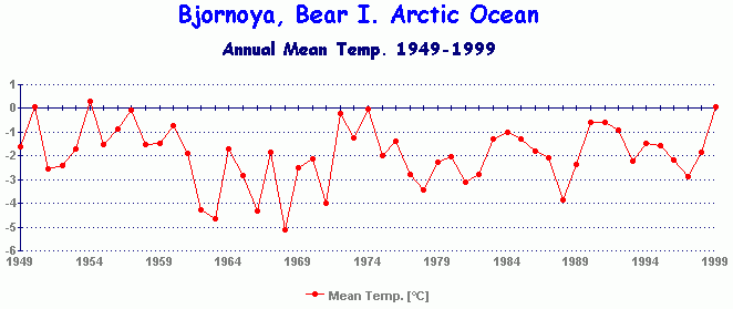
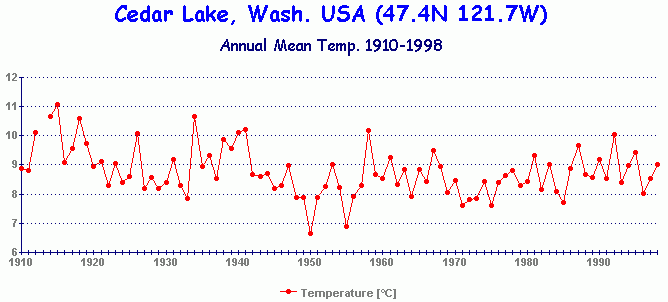
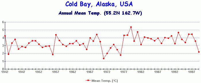
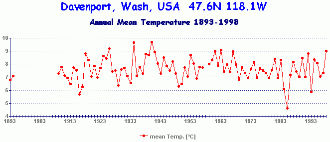
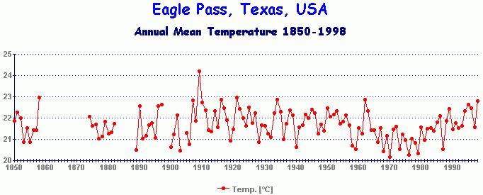
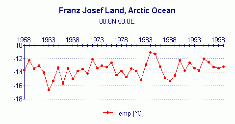
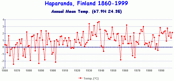
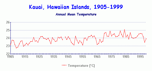
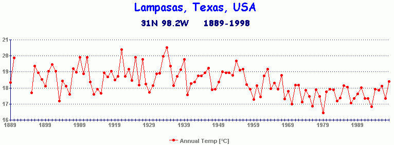
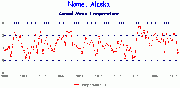
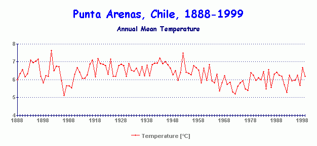
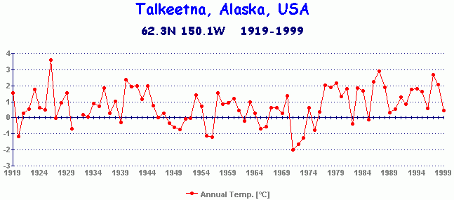
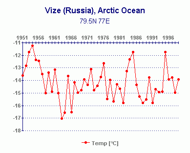
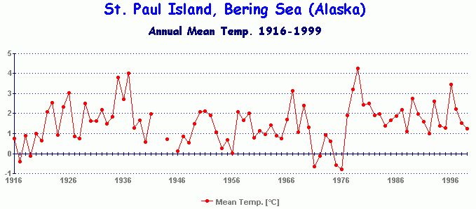
| Ajan, eastern Siberia, Russia Akureyri, northern Iceland Ashton, Idaho, USA Bear Island, Arctic Ocean Cedar Lake, WA, USA Cold Bay, Alaska, USA Davis Base, Antarctica, (Aust.) Davenport, Washington, USA Eagle Pass, Texas, USA Central England composite Franz Josef Land, Arctic Ocean Haparanda, northern Finland Kauai, Hawaii, USA Lampasas, Texas. USA Nome, Alaska, USA Mawson Base, Antarctica (Aust.) Punta Arenas, Chile Talkeetna, Alaska, USA Turuhansk, Siberia, Russia Ostrov Vize, Arctic Ocean, Russia Reboly, Karelia, Russia St. Paul Island, Bering Sea, Alaska |
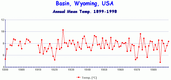
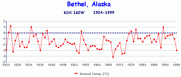
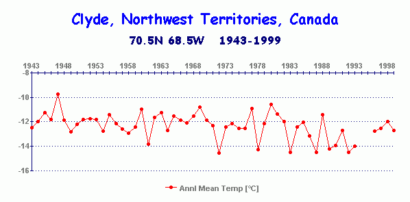
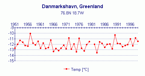
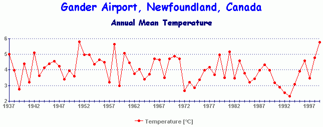
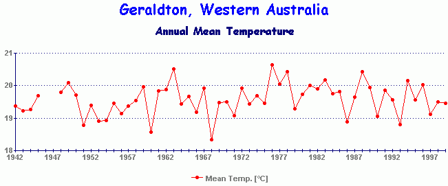
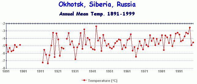
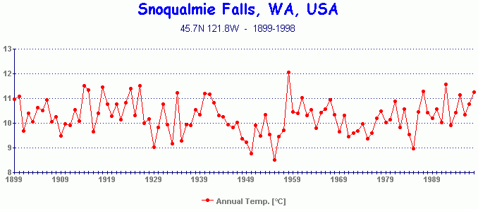
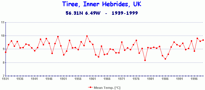
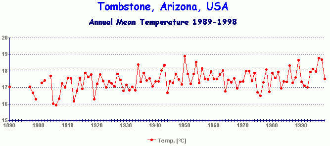
Adelaide, South Australia Amundsen Base, South Pole (US) Basin, Wyoming, USA Bethel, Alaska Clyde, Baffin Island, Canada Denmarkshavn, Greenland Dikson, Siberia, Russia Gander Internat. Airport, Canada Geraldton, Western Australia Jan Mayen Island, Arctic Ocean Korf, Kamchatka, Russia Ostrov Kotel, Arctic Ocean, Russia Launceston, Tasmania, Australia New Delhi, India Okhotsk, eastern Siberia, Russia Siberia, central Asia composite Snoqualmie Falls, Wash., USA Tiree, Inner Hebrides, Scotland, UK Thorshavn, Faeroe Is., Nth. Atlantic Tombstone, Arizona, USA Valentia Observatory, Ireland Vostok Base, Antarctica (Russian) |
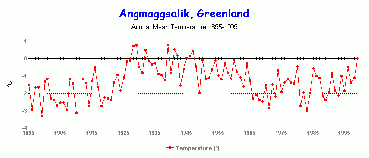
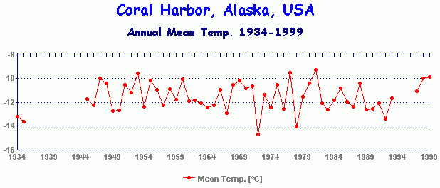
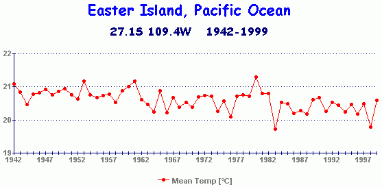
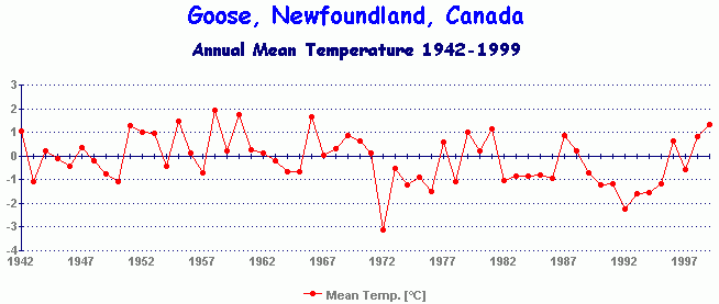
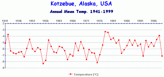
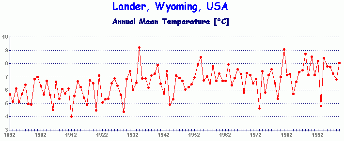
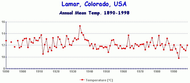
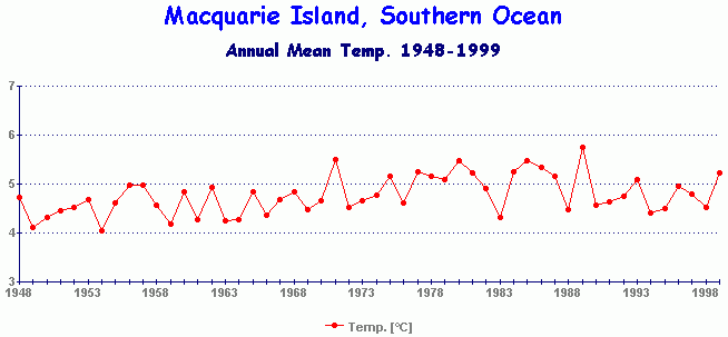
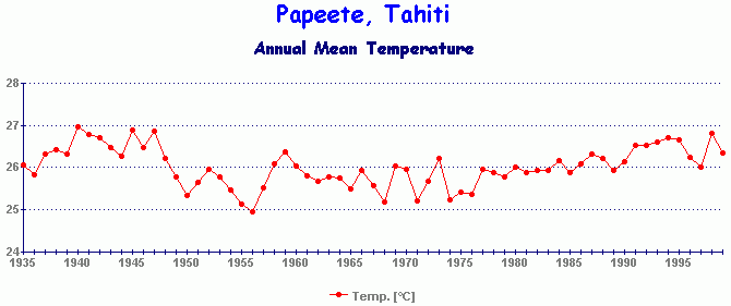
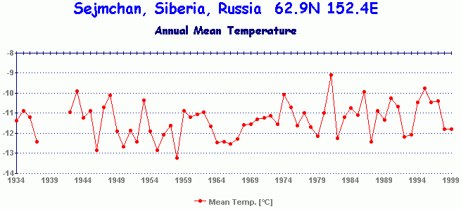
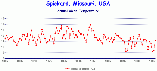
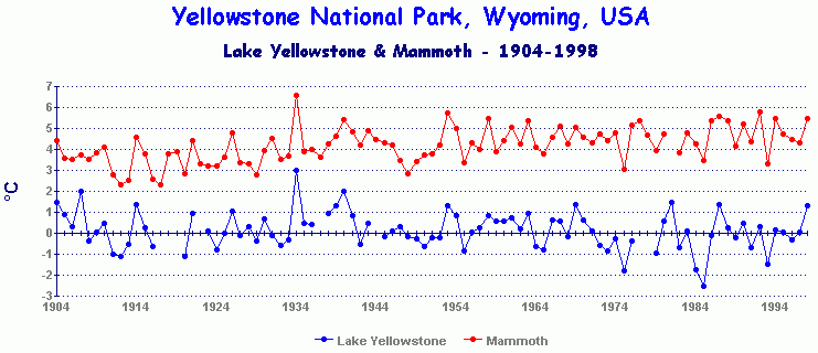
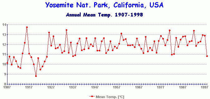
Angmaggsalik, eastern Greenland Ankara, central Turkey Casey Base, Antarctica (Aust.) Coral Harbor, Alaska, USA Darwin, N. Territory, Australia Dzardzan, Yakutskaya, Russia Easter Island, SE Pacific Ocean Goose, Newfoundland, Canada Kajaani, central Finland Kotzebue, Alaska, USA Lander, Wyoming, USA Lamar, Colorado, USA Macquarie I., Southern Ocean Olenek, Yakutskaya, Russia Papeete, Tahiti, Pacific Ocean Sejmchan, E. Siberia, Russia Sodankyla, northern Finland Spickard, Missouri, USA Tromo, Norway Vardo, Arctic coast, Norway Yellowstone National Park, USA Yosemite Nat. Park HQ, Cal., USA |
![]()
References
1] Balling & Hughes, Urban Influences on South African Temperature Trends, Int'l Jnl Clim. v.16, p.935, 1996
2] Christy, J.R., The Use of Satellites in Global Warming Forecasts, Washington Roundtable on Science & Public Policy
Feb 20 1997
3] Cook et al., Climatic Change in Tasmania Inferred from a 1089-Year Tree-Ring Chronology of Huon Pine,
Science, v.253, p.1266- 1268, (1991)
4] Curtis et al., The Urban Heat Island Effect at Fairbanks, Alaska, Theor. Appl. Climatology, 000, 000-000, (1999)
5] Donlon & Robinson, Observations of the Oceanic Thermal Skin in the Atlantic Ocean, JGR
http://frodo.colorado.edu/~cjdn/jgr_paper/JGR1_C10.html
6] Easterling & al. Maximum & Minimum Temperature Trends for the Globe, Science v.277, 18-July-1997 p.364
7] Ellsaesser & MacCracken et al, Global Climatic Trends as Revealed by the Recorded Data, Reviews of Geophysics,
v.24 no.4, pp745-792, Nov 1986
8] Friis-Christensen & Lassen, Length of the Solar Cycle: An Indicator of Solar Activity Closely Associated with Climate,
Science, v.254, p.698, Nov 1991
9) IPCC Third Assessment Report
(draft), January 2000
10] Jones et al. Assessment of Urbanization Effects in Time Series of Surface Air Temperature over Land,
Nature 347, p. 169 (1990)
11] Jones P.D., Hemispheric Surface Air Temperature Variations: A Reanalysis and an Update to 1993,
Journal of Climate, v7, p.1794, A.M.S. 1994
12] Jones et al, Comparison Between the Microwave Sounding Unit Temperature Record and the Surface Temperature
Record from 1979 to 1996: Real Differences or Potential Discontinuities?, Journal of Geophysical Research, v.102,
no.D25, p.30.135, Dec 27 1997
13] Karl T. et al, Urbanization: its detection and effect in the United States climate record J. Climate 1:1099-1123, 1988
14] Lockwood & Stamper, A Doubling of the Sun's Coronal Magnetic Field During the past 100 years, Nature v.399
p.437, (1999)
15] McConnell, Assessing the Value of Historical Temperature Measurements, Endeavour, v.16 no.2, p.80, 1992
16] Michaels et al, Predicted & Observed Long Night & Day Temperature Trends, Elsevier Atmos. Res. 1995
17] Muhlenbruch-Tegen, Long-term Surface Temperature Variations in South Africa, Suid-Afrikaanse Tydsskrif vir Werenskap,
v.88, p.197, Apr 1992
18] National Research Council, Reconciling Observations of Global Temperature Change, National Academy Press, Jan 2000
19] Newell & al, MIT Technology Review, Nov/Dec 1989, p.80
20] Nunez, M. The Urban Heat Island: Some Aspects of the Phenomenon in Hobart, Dept. of Geography, Univ. of Tasmania
Sept. 1997
21] (Personal seagoing experience)
22] Reynolds & Smith. Improved global sea surface temperature analyses, Journal of Climate, v.7 p.929, (1994)
23] Soon et al. Env. Effects of Increased Atmos. CO2, Harvard-Smithsonian Center for Astrophysics, 1999
24] Spencer & Christy, Precise Monitoring of Global Temperature Trends from Satellites, Science v.247, p.1558, March 1990
25] Svensmark H. Influence of Cosmic Rays on Earth's Climate, Geophys. Review Letters, v.81 no.22, p.5027, Nov 1998
26] Torok & Nicholls, Aust. Met. Mag., 1996, 4-Dec-96, p.251
27] Trewin, B. Another Look at Australia's Record High Temperature, Aust. Met. Mag. v.46, p.251, (1997)
28] Wentz & Schabel, Effects of Orbital Decay on Satellite-derived Lower-tropospheric Temperature Trends, Nature, v.394,
13 Aug 1998, with reply by Dr Roy Spencer
29] Wilson & Hudson, The Sun's Luminosity over a Complete Solar Cycle, Nature, v.351, 2-May-91, p.42
30] http://www.john-daly.com/surftemp.htm#comment (comment by Dr Vincent Gray)
**********ANOTHER OPINION:
Volume 3, Number 12: 15 June 2000
Although we rarely deal with things not published in the conventional peer-reviewed scientific literature, we take exception this issue to discuss a matter that has recently been addressed in several such publications. This deviation from our standard policy is taken for the important reason that these publications have convinced us that the global surface air temperature record, which is used to support the idea that the earth has warmed dramatically over the past century or so, may be incorrect.
Our tentative conversion on this matter began with our reading of John Daly's treatise on the global surface air temperature record (Daly, 2000), which is posted on the website of the Greening Earth Society (www.greeningearthsociety.org). In reference to the divergent trends of the surface air temperature record, which exhibits a dramatic warming over the past 21 years, and the lower tropospheric temperature record produced by satellite microwave sounding units, which exhibits no such warming, he cites the only three explanations that can possibly account for this discrepancy: (1) the surface record is incorrect, (2) the satellite record is incorrect, (3) both records are correct, and their different temperature trends are due to some unknown atmospheric process or processes.
Considering the same issue, Balling (2000) notes that the recent National Research Council (2000) report on the subject acknowledges that the two records should produce similar trends: "if global warming is caused by the buildup of greenhouse gases in the atmosphere, it should be evident not only at the earth's surface, but also in the lower to mid-troposphere." Indeed, the report says that the best climate models available "predict that the lower to mid troposphere should warm at least as rapidly as the earth's surface." Hence, since the two temperature trends should be close to identical, Daly's third explanation for their divergence can be ruled out, leaving us either his first or second explanation as the correct one.
Daly opts for explanation number one - the surface air temperature record is incorrect. He supports his contention with illustrations of a number of potential sources of error that are known to plague this record: (1) temporal changes in microclimate surrounding the temperature measurement site, such as urbanization, which go unrecognized or for which insufficient adjustments are made, (2) long-term degradation of the shelter housing the temperature-measuring equipment, such as its white paint becoming less reflective and its louvers partially obstructed, (3) changes in what is actually being measured, such as true daily maximum and minimum temperatures or temperatures at specified times of day, (4) changes in measurement devices and ways of accessing the data, such as changing from having to open the shelter door to read the temperature, as was done in earlier days, to not having to do so due to the automatic recording of the data, as has become typical in more recent times, (5) general station degradation and many station closures over time, (6) changing and uneven geographical representation in the surface temperature network, (7) poor attention to careful acquisition of data in many parts of the world, and (8) a number of problems associated with obtaining a correct and geographically complete record of surface air temperature over the 70% of the globe that is covered by oceans.
Michaels and Balling (2000) additionally point out the great difficulty of appropriately correcting for the onset and development of urbanization effects in stations that once were considered rural but have, in the past decade or two, experienced the encroachment of nearby cities. As they describe the situation, urban effects have largely been removed from specific temperature records when they dominate them for many decades; but when encroaching urbanization has begun to exert its influence over only the past 10 to 15 years, "we have no objective mechanism for isolating the effect." Hence, as they correctly state, "the urban effect is here [in the latter part of the record], and it will grow exponentially."
But how do we absolutely know that all, or even any, of these potential problems are indeed occurring? One way suggested by Balling is to compare the satellite record with the surface air temperature record over the portion of the earth that is known to possess the highest quality surface air temperature data. This data set comes from the U.S. Historical Climatology Network, and contains, among other things, monthly averages of mean near-surface air temperature for 1,221 high-quality largely non-urban stations within the 48 contiguous states of the United States of America.
In making this comparison, Balling found that the surface and satellite records for this portion of the globe were nearly identical, and that each showed no statistically significant trend, nor did the time series of differences between them show any such trend. He acknowledges, however, that the conterminous United States only covers 1.54% of the earth's total surface area; but he makes the point that the best near-surface air temperature records to be found on the planet match up beautifully with the measurements made from satellites. We thus conclude with him that if equally good surface air temperature records were available for the rest of the earth, they too would match up equally beautifully with the corresponding satellite record ... and show very little warming.
But are there any other reasons to believe that this should be the case? In a word, yes. And we start with a contribution from Daly on this point.
Daly notes that although various climate models differ substantially in their predictions of greenhouse warming around the globe, they all agree on one thing: the warming, if it occurs at all, should be accentuated in earth's higher latitudes. Hence, the planet's polar regions should be prime candidates for displaying the postulated warming. But when high-quality scientifically-supervised temperature records from these regions of the earth - both north and south - are checked, they too show very little warming.
Finally, we have the radiosonde or weather balloon record of temperature in the same part of the atmosphere that is monitored by satellite. Both Balling and Daly point out that its temperature history of the past two decades closely mirrors that of the satellite record, and that it once again shows very little if any warming.
In view of the near-perfect agreement among the satellite and surface records over the conterminous United States, which all show little warming over the past two decades, as well as the similar finding of little warming in high-quality stations from both of the earth's polar regions, where greenhouse warming is predicted to be greatest, plus the fact that the satellite and balloon records show little to no warming over the entire earth over this period, we thus conclude that there truly has been little if any warming due to any cause over this period of time over the entire planet, and that the only reason the surface record for the globe shows warming is that outside of the United States and a few other places of high-quality temperature measurement, the surface record is just plain wrong, for the host of reasons listed, described and illustrated by Daly, Balling, and Michaels. Furthermore, since the significant increase in greenhouse gas radiative forcing experienced to date should have produced a sizeable warming by now, if it were not thwarted by compensating mechanisms in the real atmosphere, we also believe there is no compelling reason to believe that it will necessarily produce much warming in the foreseeable future.
| Dr. Craig D. Idso President |
Dr. Keith E. Idso Vice President |
References Daly, J.L. 2000. The surface record: "Global mean temperature" and how it is determined at surface level. Report to the Greening Earth Society. Available at www.greeningearthsociety.org. Mann, M.E., Bradley, R.S. and Hughes, M.K. 1999. Northern Hemisphere temperatures during the past millennium: Inferences, uncertainties, and limitations. Geophysical Research Letters 26: 759-762. Michaels, P.J. and Balling Jr., R.C. 2000. The Satanic Gases: Clearing the Air About Global Warming. Cato Institute, Washington, DC. National Research Council, Panel on Reconciling Temperature Observations. 2000. Reconciling Observations of Global Temperature Change. National Academy Press, Washington, DC. |
No comments